

Life Essential Brand Development
Branding and Marketing Campaign
CLIENT
Life Essentials
PROJECT TYPE
Branding and Marketing Campaign
PROJECT YEAR
2019
Concept.
The Life Essentials project presented an exciting opportunity to create a brand identity that encapsulates tranquility, sophistication, and indulgence. Rooted in a serene color palette of peach and light green, complemented by sophisticated serif and graceful cursive fonts, the brand’s design conveys an air of calm sophistication. Gilded border strokes were incorporated across branding elements to enhance its luxurious appeal, symbolizing the essence of self-care and everyday elegance. The project included a 3D packaging design for body butter and soap bars, emphasizing premium quality through two-tone complementary colors, accented with black to create a bold yet refined aesthetic. A standout component of the project was the Valentine’s Day marketing campaign. Specifically designed for a younger audience, this campaign utilized vibrant two-tone complementary colors and playful yet chic elements, striking a balance between fun and premium branding. The campaign featured a visually compelling brochure and an engaging coupon book mailer, tailored to resonate with the youthful demographic.
Outcome.
The Life Essentials project successfully harmonized color, typography, and intricate detailing to create a brand identity that resonates with its target audience. The 3D packaging designs elevated the product presentation, reinforcing the premium quality and self-care focus of the brand. The Valentine’s Day campaign effectively captured the attention of younger consumers, translating into increased brand engagement and product visibility. This comprehensive approach to branding and marketing not only showcased the brand’s commitment to enhancing everyday rituals but also established Life Essentials as a symbol of indulgence and elegance.
Who Are We
At Life Essentials, we’re passionate about making your everyday moments a little more special. From our handmade soap bars to nourishing body moisturizers, jars of body butter, body lotions, and shower gels, every product is crafted with care and premium ingredients. Our goal is to blend luxury and practicality, offering items that elevate your self-care rituals while seamlessly fitting into your daily life. We believe in delivering more than just products and our goal is to deliver an experience that embodies elegance, indulgence, and the joy of taking care of yourself.

Logo Design


Business Cards Mockups


The Life Essentials letterhead was designed to reflect the brand’s sophisticated and luxurious identity while balancing elegance with everyday functionality. The bold black background creates a strong visual impact, while the delicate floral design along the left side adds a refined and feminine touch. The thoughtful two-column layout enhances both the visual appeal and usability of the piece. The first column highlights the brand’s contact information, making important details easy to locate, while the remaining space provides a clean and organized area for professional communication. Through carefully selected typography, refined design elements, and a cohesive brand style, this letterhead creates a polished stationery piece that strengthens the Life Essentials brand presence.
Letterhead Design
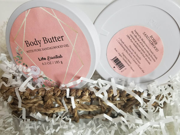
The body butter packaging was designed in Adobe InDesign, with a focus on creating a clean, premium presentation that reflected the Life Essentials brand identity. The design featured custom labels on both the lid and the base of the container, ensuring the branding remained visible from multiple angles while presenting essential product information in a clear and organized layout. Every element, from the elegant typography and refined composition to the soft peach and light green color palette, was carefully crafted to align with the overall visual identity of the Valentine's Day campaign. While embracing a minimalist aesthetic, the thoughtful label placement and cohesive design language enhanced the product's perceived value, creating a sophisticated unboxing experience and strengthening the brand's presence across the entire product collection.
Packaging Design

Soap Bar Packaging Design
As part of the Life Essentials branding project, I designed a custom soap bar packaging using Adobe InDesign, creating a structure that was both visually distinctive and functional. One of the most challenging aspects of the design was engineering the heart-shaped closure at the center, which serves as the opening mechanism for the package. This unique interactive feature required careful planning to ensure the packaging was both durable and easy to use while maintaining a premium presentation. The design seamlessly incorporated the campaign's signature peach and mint color palette, elegant typography, and playful Valentine's Day theme, creating a cohesive brand experience across all marketing materials. This sophisticated packaging not only elevated the product's shelf appeal but also strengthened the overall campaign identity, making it a memorable and engaging piece of the Life Essentials brand.

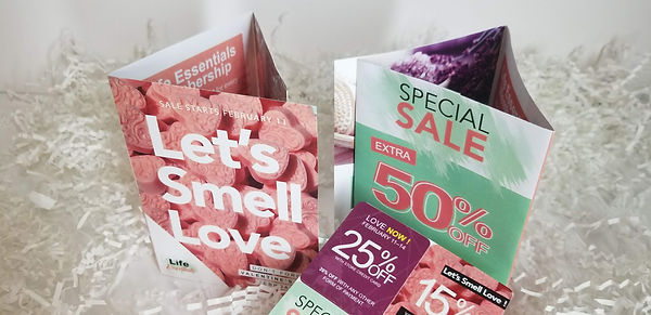
This multi-page brochure and coupon book was designed in Adobe InDesign as part of the Life Essentials Valentine’s Day campaign to educate and engage the target audience while driving product awareness and sales. Designed as a direct-mail marketing piece, the brochure was created to be delivered directly to consumers, providing a personalized brand experience while highlighting product benefits, seasonal promotions, and exclusive offers. The piece combined informative brand messaging with promotional incentives in a cohesive interactive format, allowing customers to learn about the brand, explore its products, and discover special discounts as they moved through each page. Bright complementary colors, bold typography, and high-quality product imagery were carefully balanced to create a fun yet premium aesthetic that appealed to a younger audience. The cohesive layout maintained consistency with the overall campaign identity while encouraging customer interaction, making the brochure an effective direct marketing tool and a memorable extension of the Life Essentials brand.